
In my continuing attempts to promote and improve the self-publishing scene, today I present a handful of helpful tips you can use to make your self-published print book look more professional. These tips have been compiled via examining multiple traditionally published books and comparing them to the collection of self-published books I’ve acquired over the years. Read and enjoy!
Note: I’ve used my own book for all the examples below, as copyright law is confusing and I don’t want anyone to sue me.
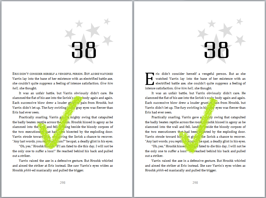
#1: Formatting your page numbers
Step 1: Page numbers should begin on the first page of your story. This means Chapter 1. If you have a prologue, use Roman numerals (i, ii, iii, iv, v, vi, etc.). Do not start page numbers on the very first page of the book (i.e. the title page).
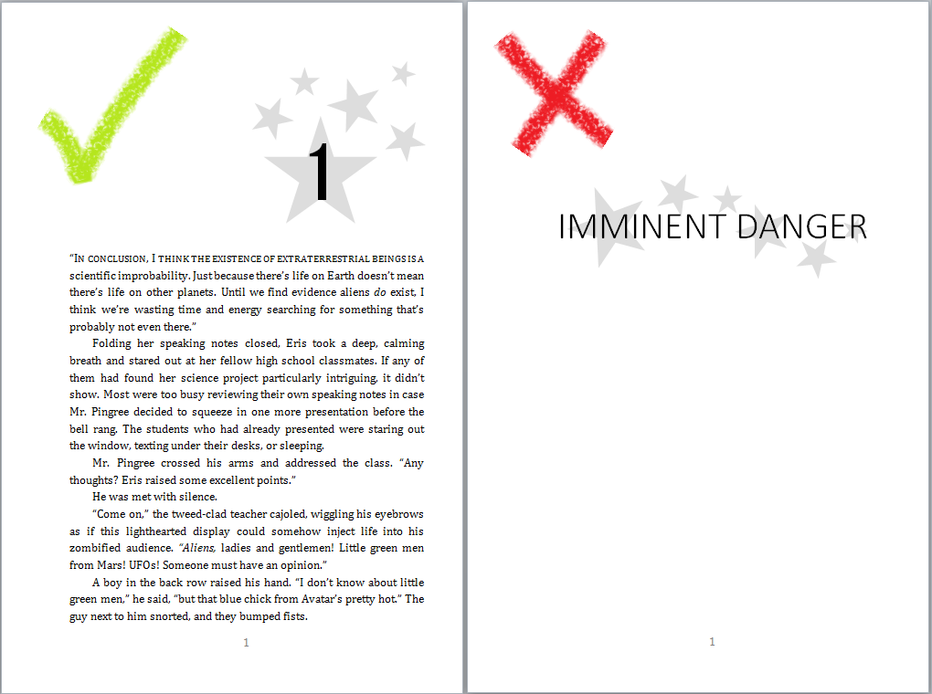 Step 2: Page numbers should end once the story is over. You can obviously keep them going into the Acknowledgements, but no blank pages at the end with page numbers. Bad!
(Updated) Step 3: Page numbers can go at the bottom of the page or the top of the page. A random survey of my bookshelf indicates it’s about 50/50. I personally prefer numbers at the bottom of the page, centered, but this one seems to be dealer’s choice!
Step 4: Put enough space between the text and the page numbers. Otherwise the page will look squished, and pages don’t enjoy being squished. That’s how bloody revolutions start.
#2: Paper choice (cream vs. white)
This is technically up to you, but cream paper really does look better than white for fiction books. White paper is for textbooks and picture books. Go with cream.

#3: Book size
I’d suggest making your book between 5×8 inches and 6×9 inches for a fiction book. Anything bigger is kind of awkward to hold. Not to mention it doesn’t fit very nicely on your bookshelf with your other novels.
#4: Formatting your title page and front matter text
Step 1: Your title page should be eye-catching. None of this “same font and size as the paragraph text” nonsense.

Step 2: Put the front matter text (i.e., copyright info, “please do not illegally distribute this work” info, publishing info, etc.) on the back of the title page (i.e., the left-hand side). The right-hand side page after the title is usually reserved for the dedication.
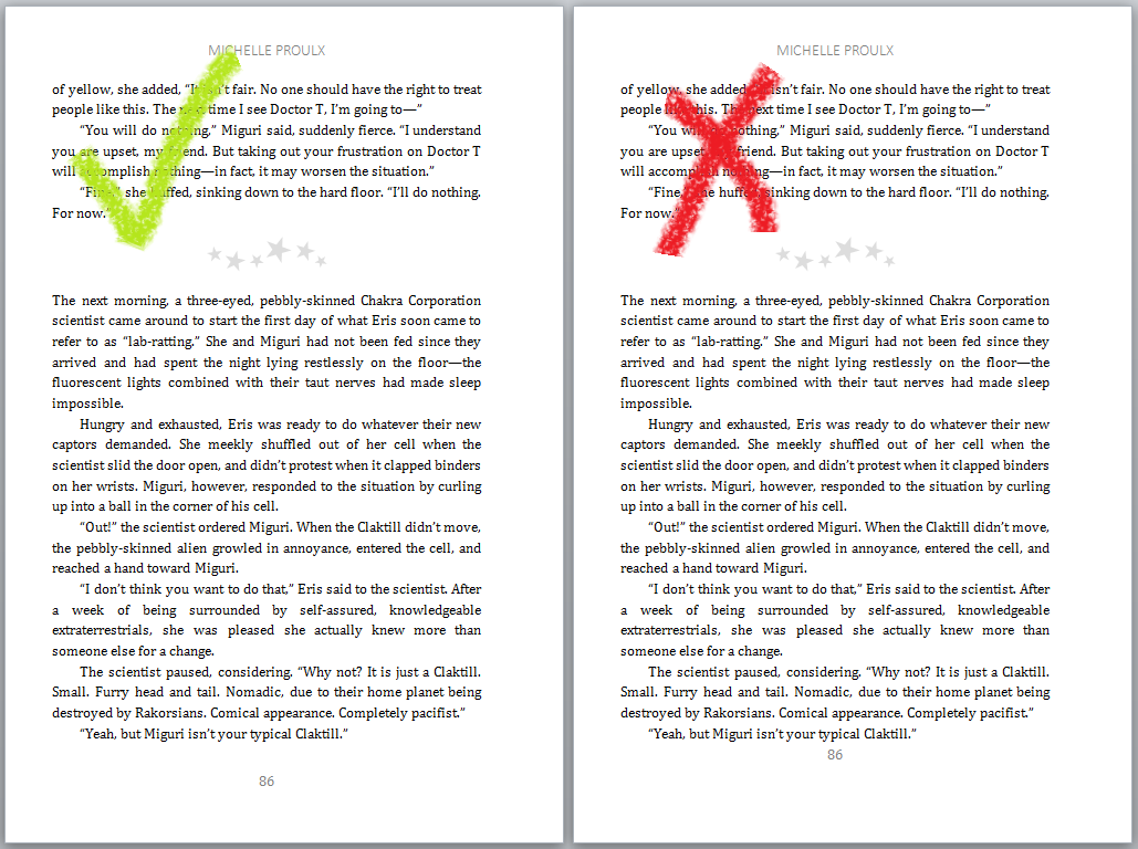
#5: Headers
Step 1: Use headers. They look classy. You want the author name on one side, and the book title on the other side. And for heaven’s sake, make sure the header is centered.

Step 2: But make sure you don’t have a header on the first page of a chapter! It makes it look cluttered. Clutter is evil.
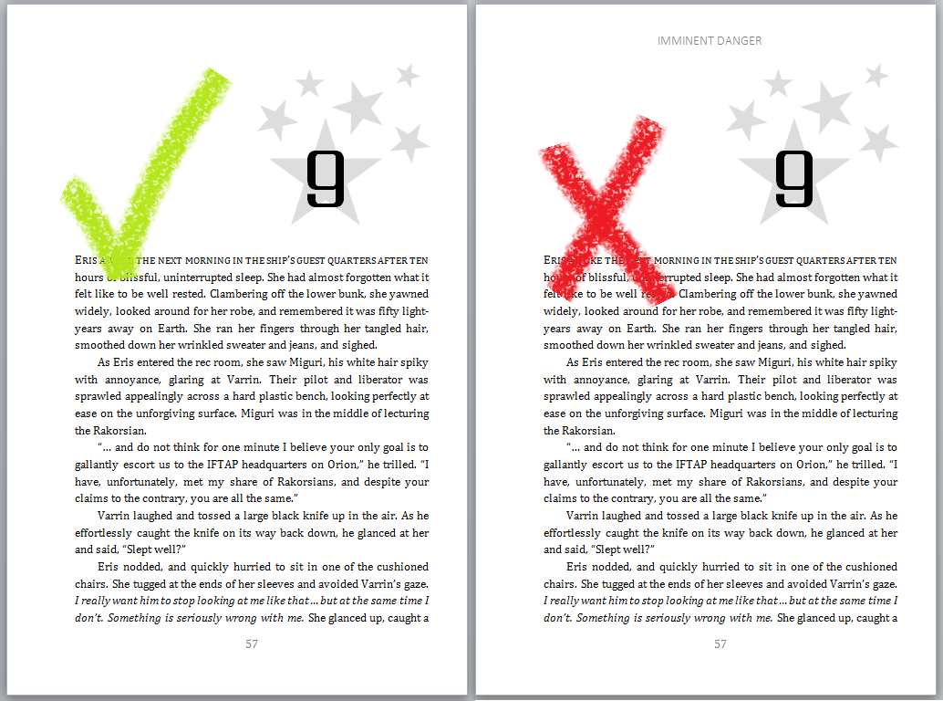
#6: Chapter titles
Step 1: Speaking of the first page of a chapter, make sure your chapter titles are eye-catching.
 Step 2: Use small caps or drop caps on the first paragraph in a new chapter.
#7: Formatting your text / paragraphs
Step 1: Don’t use Times New Roman or Arial. These are used in everything, and will make your book look generic.
Update: The important thing to note about Times New Roman and Arial is that they’re very easy to read. So make sure the font you pick is readable. Some good options include: Georgia, Cambria, Garamond, etc.
Step 2: Don’t underline. Use italics if you need to emphasize something.
Update: Some people don’t like italics used at all in writing as emphasis, and that’s personal choice. The point here is not to underline or bold your text, as it in general looks amateurish. Unless you’re writing something a bit off-beat, like a humor book or a book where your text is spaced out to look like a shark head. In which case, do whatever crazy formatting you want!
Step 3: Don’t put space between paragraphs. Instead, tweak the space between the lines of text to make sure it doesn’t look too squished. But for the love of chickens do not use double-line spacing. This makes it look like an essay, and that’s the absolute last association you want to make.

Step 4 (update): Always justify your paragraphs (as in, each line of text should reach from the left to the right side of the page). Left justification is fine for your Word doc, but it looks a bit sloppy to have uneven text edges once you get to your final published version.
#8: Cover design
Get a professional cover design. Seriously. Your readers, your sales stats, and your book itself will thank you.

Note: My Paint skills are truly out of this world.
#9: When in doubt …
When in doubt about a particular bit of formatting, pick up a traditionally published book and flip through it. Heck, pick up a couple of books. If they all tend to do the same sort of thing, formatting-wise, then you should probably do the same.
This concludes my tips! Seriously, though, flip through some traditionally published books. You can get some really great formatting ideas from them. And obviously these aren’t hard and fast rules. But if you follow them, you will definitely have a more professional-looking novel than when you started. As always, if you’ve got questions, hit me with them in the comments section below.
Happy formatting!


I kind of disagree with your #7. You should use Times New Roman or Arial because they are generic but more importantly they are readable. Other types of fonts can come across as unprofessional and sometimes makes the readers life more difficult.
Not saying you can’t use other fonts but if using other fonts then take care to make sure they are readable and not distracting. Times New Romans or Arial will still look very professional and everyone has access to it. Plus other other fonts might have no commercial use attached to them that the author might not know.
Fair point! If I picked up a book written in Comic Sans, I would probably cry myself to sleep. That being said, there are tons of other great fonts out there — Cambria, Garamond, Helvetica, etc., which are excellent substitutes for the more common Times/Arial and still extremely readable. I think I shall put in an addendum to #7 specifying the importance of the font being readable. Thanks!
I almost want to write a book now in Comic Sans, just to see what people would do, lol.
You’re welcome. The rest of your list is great btw. (Sorry I didn’t mention that earlier). Love the picture examples. 🙂
Oh, you’re making my heart hurt just thinking about an entire book in Comic Sans.
Thanks very much 🙂 The pictures took forever, but I’m really happy with how they turned out. Plus it’s always fun to mess around in Paint, lol.
Well said. I agree with everything except page number location. Before I published, I checked every paperback on my shelf and all fiction except three (and there were a lot of books) had page numbers in upper right corner. When I am trying to locate a page number, thumbing through the top right corner is much easier and quicker than trying to find it via the center at the bottom of a page. Just my opinion.
Challenge accepted! Okay, so after a random sampling of 10 books from my friend’s bookshelf, it was 5 with page numbers at bottom, 5 with page numbers at top. Well spotted! Okay, I’ll pop back into the post and add in a note. I personally prefer them at the bottom, but clearly about half the books out there disagree with me, lol. Thanks for pointing that out! 🙂
Reblogged this on Author Unpublished.
Excellent post. Thank you.
Glad you enjoyed it! 🙂
Fantastic article. Do you mind if I share this on FB with my readers?
Thanks 🙂 And please, by all means share!
Reblogged this on Wolff's Realm and commented:
Very good information for those going the self-publishing route.
Reblogged this on Legends of Windemere.
I agree with #7 as far as Arial goes. My own preference for type is Times New Roman or Garamond. Most of the time, I choose Garamond.
I’ve heard (and I don’t know if this is true) that books should use serif fonts (like Times, Garamond, etc.), because serif fonts are easier to read for long periods of time than sans-serif. I’ve found a few teen dystopian novels written in sans-serif, and I did notice the reading felt a bit … stilted.
It’s pretty much accepted in the world of printing that serif fonts are much more readable for print books. An important aspect to consider when choosing which serif font to go with is weight – how heavy it appears on the page – and the style. It’s amazing how they can affect the reading experience.
My font of choice would be Garamond. It is less ink-heavy on the page, so it allows the type to ‘breathe’, and takes up less space without looking cramped. I ran some tests comparinng Times New Roman and Garamond, and at the same point size (12pt), Garamond saved almost 50 pages on a 600 page MS at 6×9 pageblock size. That’s a lot of space, especially if you’ve written a longer book! 🙂
I’d wouldn’t advise anyone to consider Ariel for print fiction – it could come off as unprofessional. For ebooks Ariel is an option, though – the type works well on electronic pages.
Thanks for the post, btw!
I do 1.5 spaces between paragraphs.
good points . It is the fine tuning that makes a book look excellent!
Exactly! The story is obviously the most important part, but the packaging helps determine the sales 🙂
Reblogged this on mishaburnett and commented:
Some good advice on self-formatting. Except for the part about Times New Roman. Times New Roman is the Once And Future Typeface–when the stars are right the Legions of Times New Roman will rise from the vasty deeps to devour all other fonts.
Hmmm. Standard font for novels is Garamond…and standard header is author’s name on the even pages, title on the odd. One thing you didn’t mention is justifying the right margin.
As for italics – no, no, no. Not for emphasis. Your writing should convey emphasis, and you have to give your reader some leeway, not micromanage him. Also, paragraph indents should be about .25, not .5 – check some of those books from the Big Five.
All in all, I enjoy your writing… 🙂
Excellent point on the right justification. I’ll add it in!
Well, italics are a matter of opinion. I’ve seen tons of books that use them for emphasis, and tons that don’t. The really important thing here is not to underline or bold anything — unless it’s a children’s book or a humor book or something. At least, that’s my opinion 🙂
I agree with Green Embers regarding the font. Times New Roman looks professional, but I like a lot of the points you made. Thanks for having an example of white vs cream. My sister could not find a book with white pages so we could compare. I never thought of it as being like a text book.
Hey, fair enough 🙂 The awesome thing about fonts is there are so many of them, and for some reason people (including myself!) have very strong opinions of them, lol. I think I’ve just written so many essays in my life that Times New Roman has lost its charm for me.
Glad to help with the white vs. cream! It was a very real problem that came up for me because I’d originally published my book with white pages, but when I got the proof copy I was like … something is off about this book. Then I got a copy in cream and all was revealed.
Reblogged this on Audrey Driscoll's Blog and commented:
I went through this process recently with the first book in my series and can attest to all these points. My font of choice is Bookman Old Style; it’s eminently readable even at 10 pt or less. Something I didn’t do but should have was to request a proof copy and *read* it before finalizing the setup. Guaranteed you’ll catch a few tiny but oh-so-irritating errors that way. (Of course it makes the whole process take considerably longer, which is why I skipped it).
Reblogged this on The 960 Writers and commented:
Excellent advice with pictures!
I prefer outer-aligned running headers (if only for the echoes of Elder Gods in the name), rather than centred running headers.
Or, if the page number is at the top of the page, the equally pleasingly named gutter running header.
Hey, fair enough! These are, of course, just general tips. Not to mention center-formatting is the easiest thing to do, so that’s what I use, lol.
Oooh. Disagree on the Times New Roman. You want it to be easy to read. And apparently serifs are good for the eye. Should go with a Serif font. And I fully understand why people should go pro with cover design but I’m going DIY with mine. I’m a rebel with a plan!
As I keep telling my friend, the most important thing is to have a plan 🙂
My main issue with Times New Roman is that I’ve written about a gajillion essays in Times New Roman, and I’m utterly sick to death of it as a result. So whenever I see Times, I think “essay hell”.
Also, 100% agree on your serifs point. Sans-serif text in a book just feels weird to me.
Reblogged this on The Official Site of Celeste DeWolfe and commented:
Michelle, in her infinite wisdom (seriously, she’s pretty guru-esque) and general concern for publishing matters, has compiled this nifty guide that all self-publishers, especially those in charge of all their own formatting decisions, should look at.
Plus, you get to see some of her SWEET paint skills!
Reblogged this on A Shot and a Half Pint and commented:
Awesome practical tips on making your self-published work as polished as possible!
Reblogged this on YOURS IN STORYTELLING… and commented:
Turning your e-books into traditional paperback format can be a daunting process. Here are a few handy and helpful tips for folks who are planning to do it!
Im happy to say my book meets all of your points!
Woo!
I saw a presentation recently that might explain why cream paper is so popular. It explained that while contrast is important for being able to see the letters, too much contrast (black text on pure white paper) can be a bit hard on the eyes. We might not notice it consciously, but after a while it can make us more likely to put the book down. Putting the text on an off-white page makes it easier to read.
I’d never even thought about contrast being the reason I prefer cream to white — I’ve always just linked white paper in my mind with textbooks. But that does actually make a lot of sense. I do feel a bit calmer when I pick up a book with cream paper, lol.
This is a great resource. The side by side comparisons are great! I think seeing it visually in this way really gets the point across.
Thanks! That was the goal of the images — apparently it worked 🙂
Pingback: How To Add Headers To Your Book | Michelle Proulx -- The Website
Thank you for this! A friend asked me to format his story for him and it’s my first attempt at such desktop publishing. These are exactly the easy, effective tips I needed to see.
Glad to be of help! It took me forever to figure these things out, so I posted them in the hopes it might save someone else the struggle 🙂
Pingback: The Self-Publishing Journey (Part 2) | Lisa C. Chen
Great advice! Thank you
Is it ok to use italics for characters inner thoughts?
I do, so I’d say yes!
Great! Thank you very much!
thank you so much for sharing your tips on this. I was so lost. As a matter of fact I’m going to keep this window open for reference, lol.